
Choose the right map, and see what each projection distorts
Grade 9 Social Studies Worksheet - Building Confidence

Circle the best answer.
Ari wants to show where goods moved between ports and how much. Which map on Card A fits?
- Map D, the flow map: arrows show movement and their width shows how much moves
- Map B, the choropleth, because darker shading for countries with more ports shows where goods end up
- Map C, the dot map, because one dot can stand for a set amount of goods at each port
- Map A, the reference map, because it already shows the ports and the roads that link them to the cities
Luz reads Map B and says the darkest country has the most people. What is the error?
Use the picture in question 1.
- Nothing is wrong, because shading on a map of people marks the places with more people living in them
- Darker means more people per km², so a small crowded country can be darker than a large one with more people
- The darkest country must be the smallest one, because a choropleth gives its darkest shade to the smallest area
- The key is wrong, because it should say one dot equals 10,000 people, as on Map C does for dots
Read this first
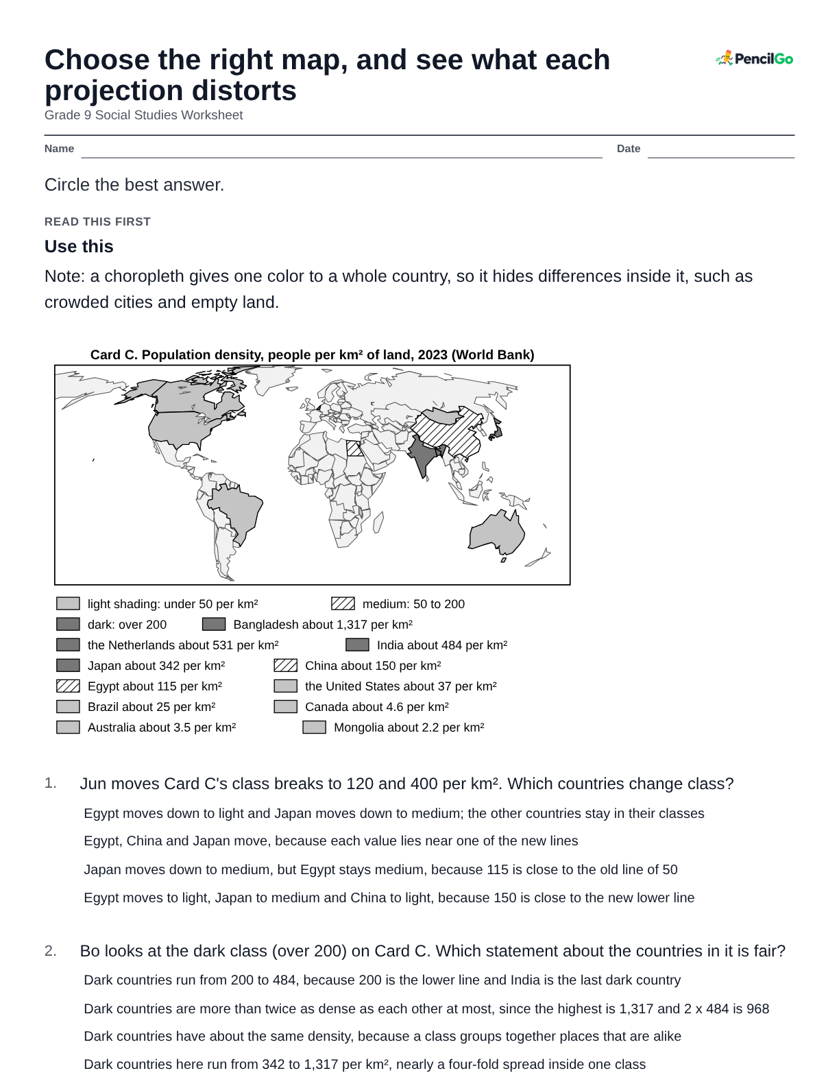
Use this
Card B (made up for practice). A region with three districts, drawn on a dot map where one dot = 10,000 people. District X covers 70 km² and holds 35 dots. District Y covers 12 km² and holds 12 dots. District Z covers 200 km² and holds 20 dots. A choropleth key for the same region: light shading under 2,000 people per km²; medium 2,000 to 6,000; dark over 6,000.
Pia reads the dot map on Card B. Which district has the most people, and which is the densest?
- Y has the most people, because its dots are packed the closest together on the map
- Z is the densest, because its 20 dots are spread over the largest district and so look the most settled
- X has the most people (35 dots), but Y is the densest, with 12 dots on 12 km²
- X is both, because the district with the most dots is the one with the most people per km² too
Bo shades Card B's districts by their total number of people instead of density. Which district looks busiest, and why is that misleading?
- X looks busiest and that is not misleading, because the district with the most people is the most crowded
- Y looks busiest, which is misleading because it has the fewest dots on the dot map
- Z looks busiest, because the largest district must hold the most people and the total shows it
- X looks busiest by total, but Y is denser; totals ignore the land each district covers
Milo applies Card B's choropleth key to the three districts. Which shading does each get?
- X dark, Y dark, Z light, because 5,000 is close enough to 6,000 to be rounded up into the top class
- X medium, Y dark, Z light, from their densities of 5,000, 10,000 and 1,000 per km²
- X dark, Z medium, Y light, because shading follows the number of dots in each district
- X medium, Y medium, Z light, because Y's 10,000 is a small step above the medium class
Zee says: "District Y has fewer dots than X, so it must be less crowded." Why is that wrong?
- Y is less crowded, because 12 dots on 12 km² is one dot per km² and X has more dots in total
- Fewer dots means fewer people, and fewer people means less crowded, so the note is right
- Y's 12 dots sit on just 12 km², so it has 10,000 people per km² against X's 5,000
- Each dot on a dot map is a village, so Y has fewer villages than X, but its villages are larger
Kira shades Card B's districts by total people. What is the fair fix for comparing how crowded they are?
- Shade by people per dot, dividing each total by the number of dots in the district
- Switch to a reference map, because totals of people cannot be mapped with shading
- Keep the totals, because the district with the darkest shade then marks where people are most crowded
- Shade by people per km², dividing each district's total by its area
Use this
Card A. Four maps on one page. Map A, a reference map, shows rivers, roads, cities and borders. Map B, a choropleth map, shades each country by its population density. Map C, a dot map, uses one dot for each 10,000 people. Map D, a flow map, draws arrows whose width shows how many goods move between ports. Key: on Map B, darker shading means more people per km²; on Map C, one dot = 10,000 people; on Map D, a wider arrow = more goods. Card B (made up for practice). A region with three districts, drawn on a dot map where one dot = 10,000 people. District X covers 70 km² and holds 35 dots. District Y covers 12 km² and holds 12 dots. District Z covers 200 km² and holds 20 dots. A choropleth key for the same region: light shading under 2,000 people per km²; medium 2,000 to 6,000; dark over 6,000.
Ren counts X's 35 dots on Card B and says X has 350,000 people. What does that count give, and what does it leave out?
- It gives the number of people, 350,000, but not density, which also needs the district's area of 70 km²
- It gives both, because the district with the most dots is also the most crowded one on the map
- No, X has 35,000 people, because a dot on a dot map stands for 1,000 people
- It gives the number of people, and also the area, because the dots fill the district to the border
Esme maps average yearly rainfall for each country. Which map type fits, and why not a dot map?
- A reference map, because it shows rivers, which are the places where the rain has run off
- A flow map, because rain moves from the sea over the land and arrows show movement
- A dot map, with one dot for each millimeter of rain, because dots can stand for any amount
- A choropleth, because rainfall is a rate for each area, like density; dots count separate things
Use this
Card A. Four maps on one page. Map A, a reference map, shows rivers, roads, cities and borders. Map B, a choropleth map, shades each country by its population density. Map C, a dot map, uses one dot for each 10,000 people. Map D, a flow map, draws arrows whose width shows how many goods move between ports. Key: on Map B, darker shading means more people per km²; on Map C, one dot = 10,000 people; on Map D, a wider arrow = more goods. Card B (made up for practice). A region with three districts, drawn on a dot map where one dot = 10,000 people. District X covers 70 km² and holds 35 dots. District Y covers 12 km² and holds 12 dots. District Z covers 200 km² and holds 20 dots. A choropleth key for the same region: light shading under 2,000 people per km²; medium 2,000 to 6,000; dark over 6,000.
Noah needs to see where the people of District X sit within the district. Which Card A map type fits, and what does it show that a choropleth cannot?
- A reference map, because the road lines show where the dots would be and so where the people are
- A flow map, because wide arrows show where people live and how far they commute
- A choropleth, because its shade for the district shows where inside the district the people are packed
- A dot map, because dots show where people sit inside a district, which one shade for the whole district cannot